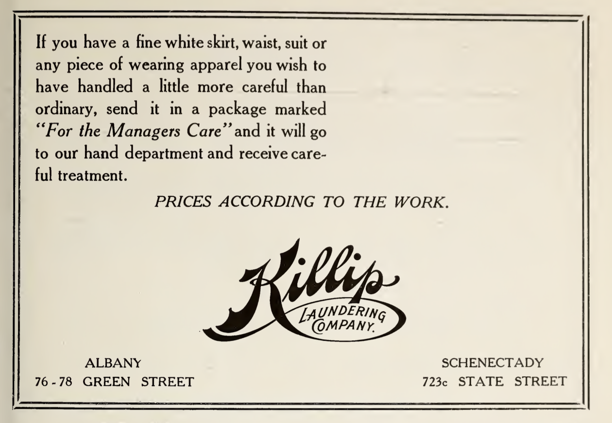
Just take a moment and appreciate the beauty of this ad the Killip Laundering Company, from 1917. Some fine letterer or sign-painter rendered that gorgeous logo in brush and ink. Another craftsman cut the design into a matrix that could be used to make a lead or brass cut, which could then be set up in a form for printing. Someone else thought carefully about that copy, designed to appeal to the Albany blue bloods who would peruse the Blue Book in which it was printed. A typesetter lined it all up, carefully justifying the copy in a nice set of Cheltenham, with a little more leading between the lines than normal, just to give it that open feeling.
But, ya know, pixels are fine, too.