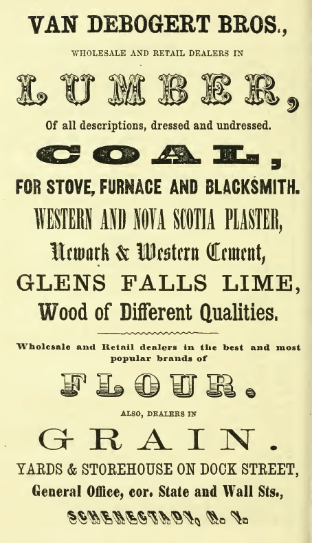
This Schenectady city directory was probably printed by Joel Munsell’s large printing house in Albany. If you were a big, successful printing house with dozens or perhaps hundreds of fonts available, you wanted to let people know that, even if you had to do it on the back of an innocent merchant.
The disincentive to this kind of typographical splattering is one I’d love to see returned to use today, to put an end to people who think they can design in Word and that “text art” is ever a good idea. (N.B.: It is not.) When the printing was done, the ink wiped away and the forms were broken up, somebody in the composing room had to put every single character on this page away, in its proper slot, in the right drawer, in the right size. It would have taken a lot of time, and would have made you think twice before you’d try the shotgun-font effect again. If only we could get that disincentive back.

