Hoxsie departs from its love of Albany, Schenectady and Troy history for a brief foray into offset printing history –
Someone recently reached out to a page I administer for the AM Varityper Phototypesetters, sending along some pictures of something that had been in his house since he bought it ten years ago. And at first blush, the pictures certainly looked like somewhat standard phototypesetting discs – except that they were made of metal, rather rough on the edges and in the center, and not in any way transparent. So while they looked like the discs that were used to create phototype, that’s not what they were.
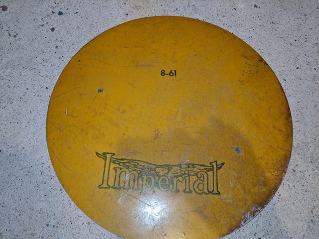
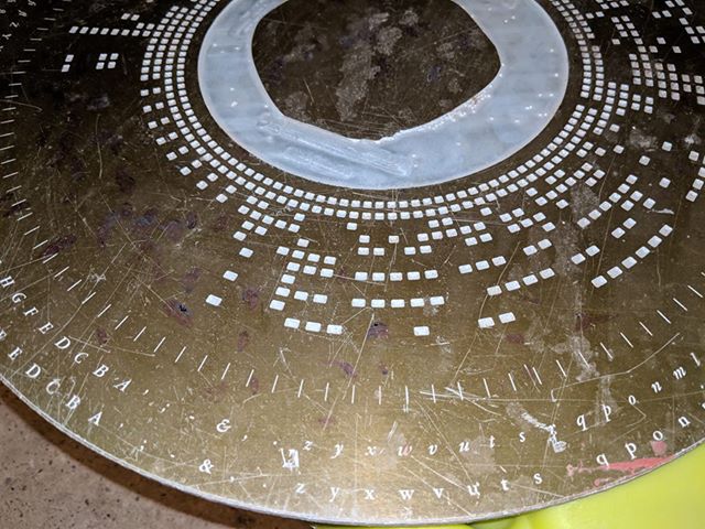
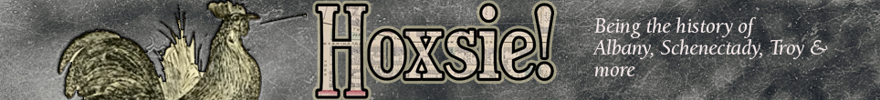
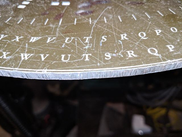
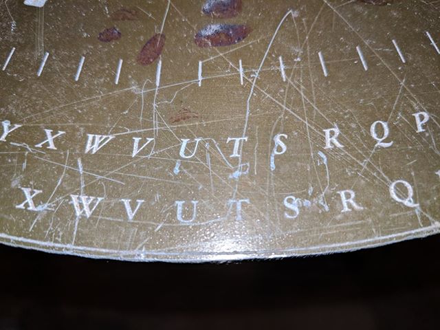
He said they were 16.75 inches across and more than 1/8 inch thick. The fronts certainly look like something that would be familiar to anyone who ever set phototype. There are alphabet characters (I can’t identify the font exactly, but it’s a fairly standard style in the vicinity of Garamond). Then, there are little rectangles, in rows of 8, associated with each character, and a smaller set of two more running just inside near a central circle. Clearly, these are codes that let the machine identify where the disc is positioned – in a phototypesetter, these discs would spin quite quickly, and when the needed letter was in front of the light source, there would be a flash of light to expose the character onto the sensitized paper on which the type was set. You think digital is amazing? These things were photomechanical wonders. The back, interestingly, has a wonderful logo that just says “Imperial.” So, I can only deduce that what we’re looking at here is a master – the form from which a phototypesetting disc was made. The disc itself would have been either glass (as some of the larger ones were) or plastic film.
At first, I didn’t find much looking for “Imperial” and “phototypesetting.” Then I had the flash that may be Imperial just supplied the metal, and not what was on the other side. That turned out to be incorrect, but led me to the right company anyway. Imperial is the Imperial Type Metal Company of Philadelphia. Formed as the Imperial Metal Co. in 1913, it was renamed as Imperial Type Metal Co. in 1915. Founded by a Wilson S. Yerger, specializing in the manufacture of metal that was used in creating type, focusing on its metallurgical expertise.
But I couldn’t find anything that indicated a foray into phototypesetting – which was something a LOT of companies got into, even when they didn’t have any previous printing industry experience. Singer is one example. But I did find a couple of patents that looked promising. For instance, Imperial Type Metal (of 3400 Aramingo Avenue, Philadelphia, a site that has long since been redeveloped, but was, not surprisingly, a federal superfund site) held a trademark for Vitacoat and another for Vitacold, both registered on the same day in 1963. Vitacoat was a water solution of methyl violet dye used to develop the photographic image formed on a photoengraving plate; Vitacold was a water solution of shellac and ammonium dichromate with other ammonium compounds added, applied to a sheet of photoengraving metal as a liquid and is dried. Vitacold as a trademark also appears to have applied to a methyl alcohol solution of methyl violet dye used to develop the photographic image formed on a photoengraving plate by a light sensitive cold top. They also held a patent, registered in 1968, for a powderless etching method for etching relief images in aluminum. These are all related to photographic printing plate technologies of the type used in the photographic offset printing revolution. But still . . . they didn’t appear to have made a phototypesetter itself.
Then there was another flash – perhaps Imperial, experts in printing plate technology and innovative metallurgy (etching in aluminum was a challenge) just made the masters for some other phototype company? So I started by searching for Photon, the company that started it all and with which I was least familiar. A nifty little history of Photon I found mentioned a phototypesetter by Harris Intertype:
The Harris phototypesetter, called a TXT, was about eight feet long, four feet wide, and six feet tall. The fonts were on a half dozen platter-sized glass plates spinning at high speed at the ends of radial arms that rotated around when a type face change was called for. These monsters were used by newspapers well into the 1980s.
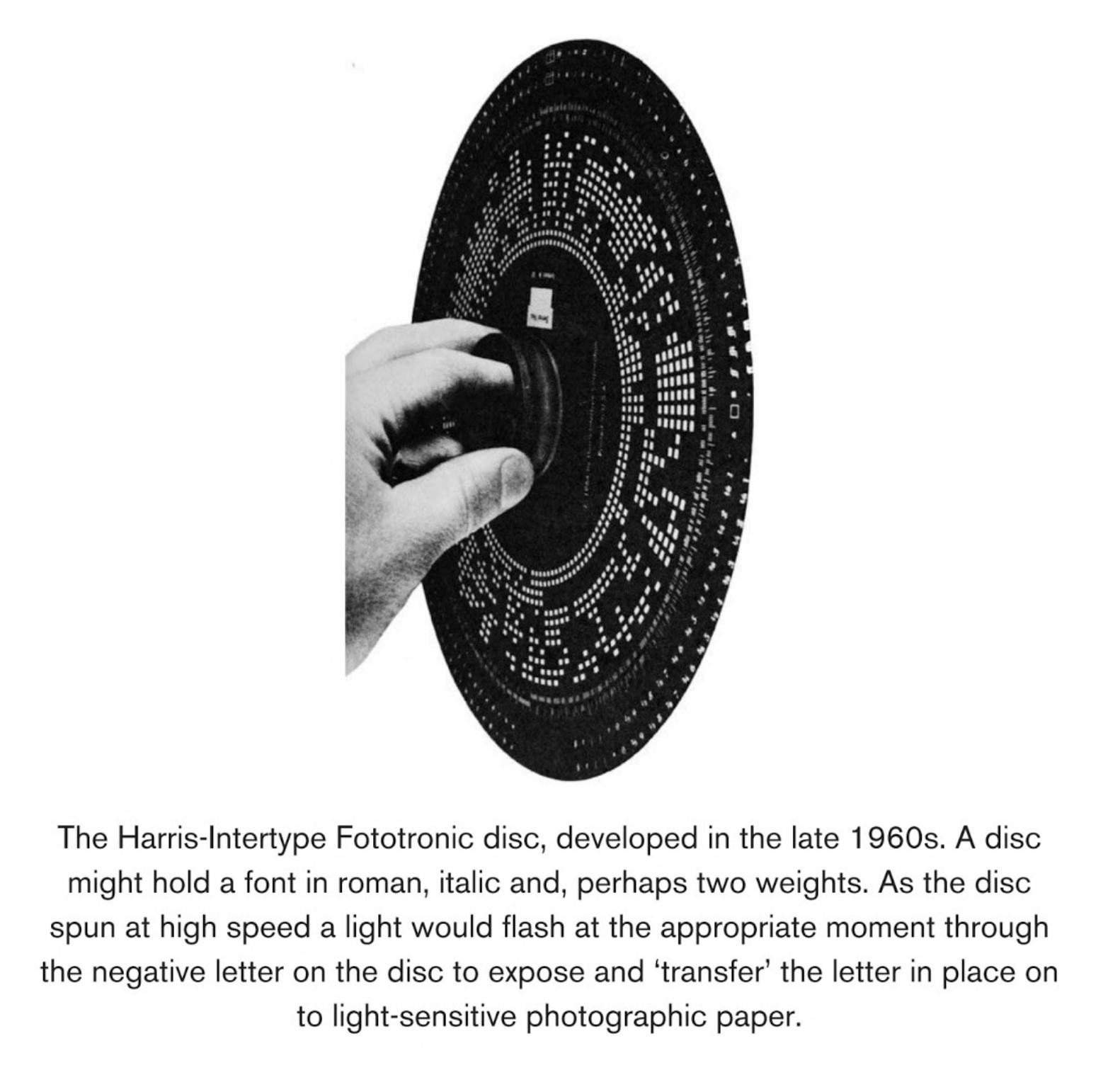
Platter-sized, you say? Intriguing – because what I was looking for, 16.75 inches across, would qualify as platter-sized. It would also appear that the Harris machine used an eight-hole punch tape for its coding (punch-tape machines used in typesetting varied between six and eight holes across for coding). Now, I just needed to find an image of the Harris-Intertype disc. What are the odds of that? Ahh, it’s the age of the internet; the odds are fairly high. And while the book I needed, David Jury’s “Reinventing Print: Technology and Craft in Typography” isn’t fully available online, its preview was enough – right there is an image of the Harris-Intertype Fototronic disc. Characters on the outside, code boxes on the inside, and a good-sized disc: looks like the Fototronic is at least a close relative of the master we were looking at. So at this point I’m pretty sure this is an Imperial master for a Harris-Intertype phototypesetting disc.
Even among collectors of old printing equipment, this is a somewhat obscure part of the process – the device that made the device that made the type. But it was a fun mystery to try to solve!
Update!
In 2021, Stanley DePassos has been good enough to share the following with us:
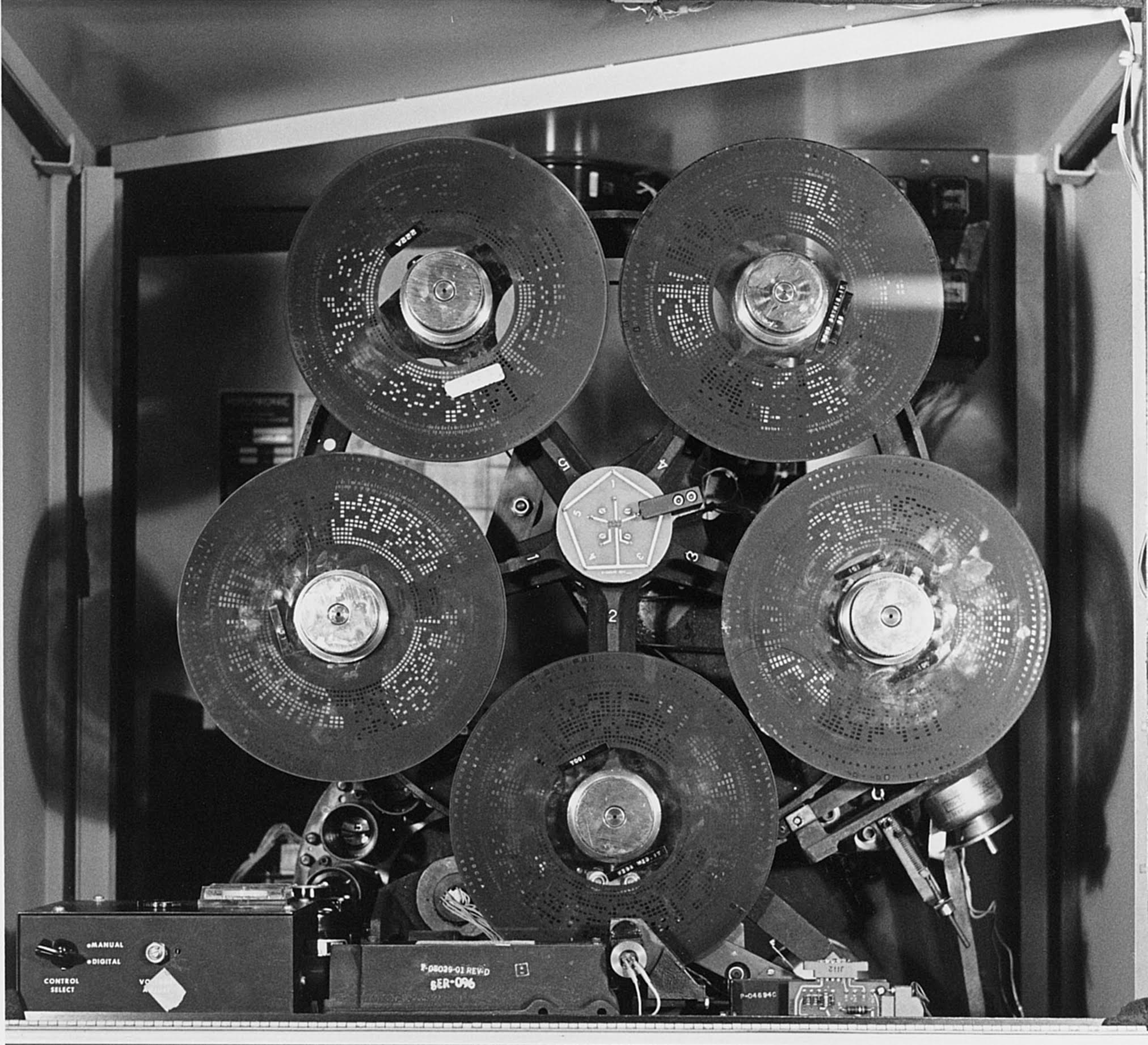
“Attached here, is a photo of the inside of a Harris Fototronic 4000. This dates from about 1982 at New England Typographic Service in Bloomfield, CT.
“You can see the five glass disk fonts mounted on a turret. In operation, the disks spin continuously at 3,600 RPM. Each font has two typefaces, usually roman and italics of the same weight. To change fonts, the machine rotates the entire turret while the disks are spinning; quite a feat of engineering. At the lower left (below disk #1) you can see a portion of the lens turret. There were 12 lenses, one for each point size available on the machine. The range was usually from six to 24-point type. When a size change command is received, the lens turret also rotates to position the correct lens behind the font. Fonts are changed by unscrewing the chrome knob at the center of each disk mount.
“As I recall, fonts cost about $900, real money in the 1970s and ‘80s. You would not want to drop a font while changing them.
“The Fototronic was usually installed into a wall so the film could be loaded and unloaded in a darkroom or there was a person-sized closet attached to the back of the machine that was light-tight.”
I have a Harris disk from a Fototronic 1200 typesetter. I wrote software to interface with one in the late 1970’s. Each disk had two fonts, the inner and outer. Typically it was regular and italic or regular and bold. Mine is Helvettica regular. The inner square holes are the encoding of the character widths.
The device had a pentagram, holding 5 disks. It would rotate the selected disk into place in front of a strobing light source. There was also a rotating disk of lenses to allow for changing size. So to set a character you would make sure the disk was rotated into position with the right lens and then it would flash the light through the spinning disk at the precise time to image it on the photographic paper and advance the amount for the next character.
I used the Fototronic TxT and 4000 models in the 1970s and ’80s. I kept one of the glass disc fonts and it is 9.75″ in diameter. Since the discs were manufactured photographically, I don’t see how your metal disk could be used to make fonts. The font disks appear to have a photographic emulsion on one side but I don’t know if it was exposed in a contact frame or via some type of projection. Later fonts did away with the square character codes in favor of a second row of slits: one for timing and one for to identify the character.
William Shipley’s description of the machine is correct. The font turret was driven by a belt and the fonts rotated at 3,600 rpm. Typesetting speed on the later model machines was in excess of 100 newspaper lines per minute. It was also possible to purchase high-speed fonts that contained two copies of the most common letter in each row (e, t, a, i, etc.). These were specifically for newspapers, attaining even higher speeds. Many commercial printers and trade typographers adopted the Fototronic machines. They were beautifully engineered, much more reliable than their competitors. Unfortunately, Harris lacked the authentic type library of Linotype which limited their use in ad typography.
I have photos of the inside of a 4000 model which I can send if you are interested.
Thanks, and sorry it took so long to approve the comment; I didn’t get a notification on it. I’d be glad to post your pics!
My father has a glass Photon Inc Disc 2F in a wooden box. The disc includes eight fonts.